Traci Reed Creative Team | Scraplifting Cathy Caines
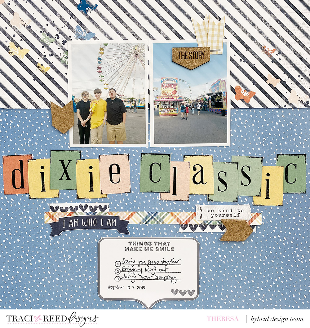
Hi friends and welcome back! Today we are scraplifting one of our esteemed members of the Traci Reed Creative Team, Cathy Caines! Scraplifting is such a fun way to play with our craft, learn more about another scrapbooker’s process, and have fun. Cathy has such a beautiful, minimalist style, and you can find her on Instagram here: @inthecatcave. I am working with the Traci Reed Time To Thrive collection to create a layout for this 2019 visit to the Dixie Classic Fair. Follow along with my process below!
This is Cathy’s layout that I was inspired by for my layout. You will see her minimalist style that emphasizes the photo + the story. The only embellishments are the alphabet title and the tiny heart! Her journaling stands out in the way she has formatted it and also in her tender words. The challenge for me was taking her layout and making it my own, as I am definitely not a minimalist and I love adding all the things. But it was so much fun to do exactly that – take her classic layout and add all the things to make this layout my own version.

It turned out that many of the things I did were exact opposites of Cathy! I’ve used the same page layout, but where she used plain white as her background, I chose two patterned papers. Her background is plain white with no added texture or color, and I added the mixed media butterflies to the black and white patterned paper before printing. She used very plain but colorful alphabets for her title, I’ve jazzed up the digital alphabet in the Time To Thrive kit to add color to my layout. She used one photo, and I printed two smaller photos. Note how the two photos on my page still read visually as Cathy’s one photo. You could also do a photo collage. Cathy also has no transition from title to journaling, but I added the plaid washi strip and other embellishments and then placed the speech bubble underneath that to house my journaling. While Cathy wrote out her beautiful words in a letter style, I used a line stamp from Elle’s Studio and made a list!


As a final touch, I added a few cork embellishments around the page, just to add a bit of texture and contrast. In addition to my process video, I also wanted to share a Photoshop In Five tutorial with you, about how I changed up these digital alphabets on this layout to create this fun title. Watch below!
I hope you’ve enjoyed seeing this “opposites” take on Cathy’s layouts! Thanks for joining me, see you again soon.
~Theresa