
IMP Kids Album Edition Module 01 Magical

Hello Lovelies and welcome to the fourth layout in Module 01! This layout is all about texture and I think you are going to love it! Check out the process video here.
Password: impkids2019
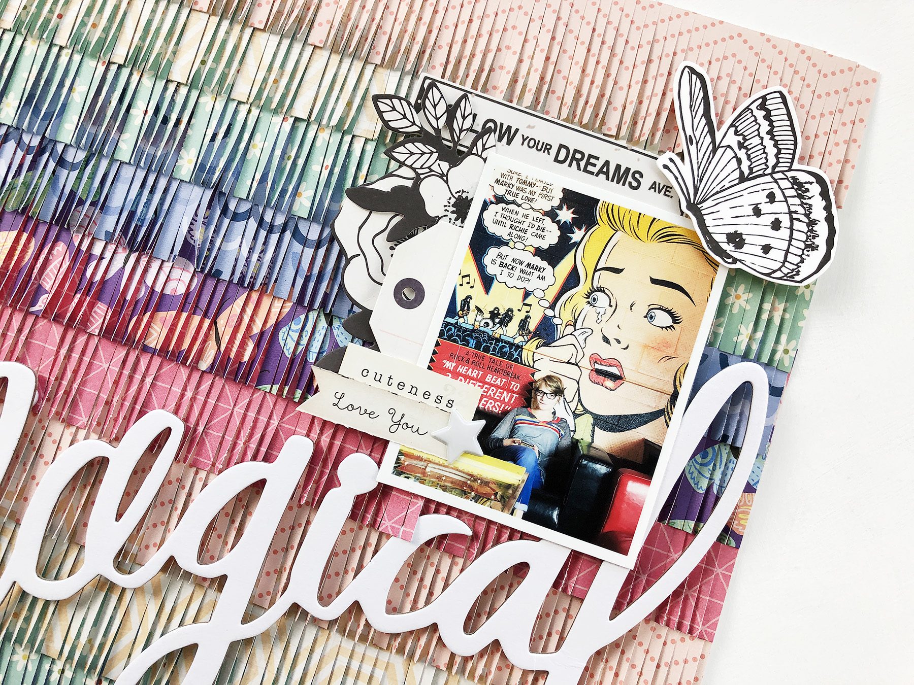
My photo for this layout is a really stunning photo of Emberlynn at one of our favorite vintage arcade hang-outs. The sitting area features this amazing comic strip on the wall and she was just hanging out there on her phone, and it is just one of my absolute favorite photos ever. Emberlynn loves two things: rainbows and butterflies, so I take any opportunity I can to include those on her pages.
For this layout I had the idea to create a rainbow fringe background, so I pulled rainbow colors from my paper stash to make the base. I cut two inch strips from each color twice, and then cut them using my fringe scissors. I then layered them one on top of the other in rainbow order to create this background. It just made me so happy to see all this pattern and texture, and also created a bit of a challenge: how to make anything pop on top of all the visual interest I had already given this layout?

Any time you have a very colorful background black and white are a sure bet. The idea is to create contrast, and black and white contrast well against any colors. I printed her photo with a white border to help it pop already, and then I chose black and white embellishments from my stash as well. The white title adhered at a strong angle establishes the direction the layout is taking. Visually your eye is going to start at the beginning of the words, with the first butterfly and the journaling spot at the lower left.

As your eye reads the title it is then led to the top right of the layout, where the photo and the primary embellishment cluster sit. Along the way your eye will be able to take in all that gorgeous texture and pattern.
So your take-away from this is to use pattern and texture to create a background, use contrast to make your elements pop, and use diagonal lines to lead your eye across the page. It’s like a magical trifecta of graphic design goodness. Ha! Thanks so much for joining me in this module!